Overview
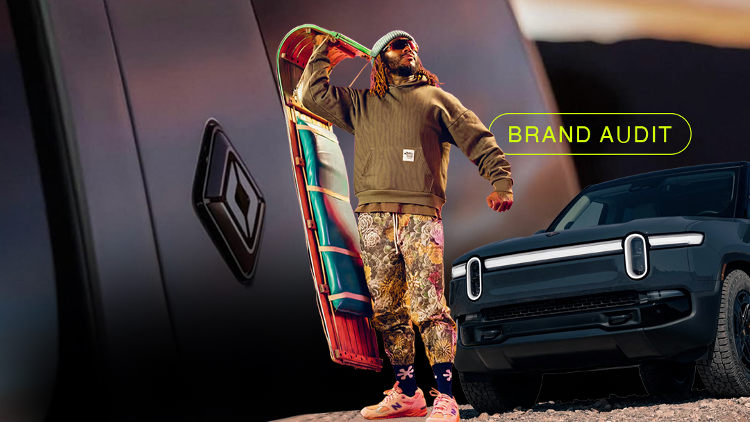
One of the brands that have been on my radar has been a certain automotive upstart poised to take over where Tesla left off. Rivian is at a pivotal moment—fresh off triggering a $5.8 billion joint venture with Volkswagen to boost software-led EV development, and rolling toward its more affordable R2 SUV, expected in 2026.
This brand audit explores how Rivian balances its adventure ethos with thoughtful brand-building—anchored in design, storytelling, and strategic restraint.
Brand Identity Checkup
Rivian’s brand identity is one of the most thoughtfully crafted in the EV category. While many startups rush into branding, Rivian held off. The company operated without a formal logo for nearly a decade, only unveiling its now-iconic emblem in 2018—just after acquiring its manufacturing plant in Normal, Illinois. That restraint wasn’t an oversight; it was intentional. The brand waited until it had a clear sense of purpose before putting a symbol to its name.
At the heart of Rivian’s visual identity is the Rivian Compass—a squared-off emblem designed to reflect the brand’s adventurous spirit.
Logo & Wordmark
Rivian’s compass-shaped logo features four arrows, pointing north, south, east, and west. The outer arrows (north and south) reflect Rivian’s mission: to make the world a better place through innovation and adventure. The inner arrows (east and west) represent its brand behaviors—being inspiring and inviting to all.
It’s a rare case of a logo acting not only as a visual symbol but as a brand manifesto. It doesn’t hide meanings in negative space or aim for cleverness. Instead, it’s direct, symmetrical, and emotional—anchoring the brand in a timeless exploration narrative.
The accompanying wordmark, when used, appears in a custom bold, geometric sans serif typeface—modern, forward-thinking, and industrial. It feels engineered for adventure, and it holds its own next to luxury automotive marks like Land Rover or Lucid.
Grade: A
A logo that balances function, symbolism, and aspiration—without trying too hard.
Typography & Style
Rivian’s custom typeface (“Adventure”) and design system are rooted in clean geometry, evoking structure and confidence while remaining highly legible across product interfaces, physical branding, and digital platforms.
It scales beautifully—across dashboards, websites, and even merch. The styling doesn’t deviate for the sake of trend. It reinforces the core of the brand: performance, utility, and intelligence.
Grade: A–
Strategic and consistent—though brand storytelling through type still has room to evolve as the product line grows.
Color System
Rivian’s color palette tells a multi-layered story:
- Yellow: The brand’s signature tone evokes imagination, warmth, and optimism. It’s vibrant but not overly playful—perfectly positioned for a tech-meets-nature brand.
- Black: Used to ground the logo in sophistication, elegance, and strength—especially in more formal or luxury-forward contexts.
- White: Offers clarity and neutrality. It’s often used as negative space, framing the compass and reinforcing simplicity and calm.
This three-tone system is emotionally intelligent—each color serving a function in both digital and real-world environments.
Grade: A
Distinct without being trendy. The palette adapts across surfaces and touchpoints without losing meaning.
One thing I would adjust is the 2 color wordmark and logo to include more monochromatic colors like white and black for both.
Brand Voice
While not as loud as Tesla or as heritage-driven as Jeep, Rivian’s tone of voice is measured, intentional, and emotionally resonant. The brand doesn’t lean on bravado—it opts for calm, visionary confidence.
Every piece of copy—from social captions to investor letters—supports a clear mission: to reimagine exploration for a new generation of adventurers.
Grade: B+
Strategic and consistent, though not yet a cultural voice. Increased narrative layering could elevate its influence.
Rebrand Status
📌 Stay the Course Rivian you’re doing great! Rivian’s brand identity is well-calibrated. No rebrand needed—just continued refinement and emotional depth as new vehicles (like the R2 and R3) enter the market.
Strategic Moves
Top Needs Entering the Year
- Extend global reach
- Build narrative infrastructure around “why” not just “what”
Transition from premium niche to scalable ecosystem
Competitive Positioning
Benchmarking
- Leading adventure EV space with R1T/R1S but contending with Tesla, Ford Lightning
- VW JV positions Rivian as both resilient startup and mature technology partner
Depth Plays
- Packaging/Artifacts: Effective use of experiential content (e.g., factory tours)
- Social Content: Clean, posted narrative; lacks viral spikes
- Founder Visibility: RJ Scaringe keeps a low profile—trustworthy, but low-star power
- Community & Merch: Cultivates loyalty with gear and owner-led events
- Merchandising: Lifestyle tie-in aligns with adventure ethos
COMPs: Brand Comparables
Partnership Potential
After their partnership in “sound” with TheBrosFresh (LINK) and their underrated track (LINK).
Creative Collab
Patagonia — a co-branded capsule that merges environmental storytelling, design, and product culture.
Retail/Distribution
REI or Bass Pro Shops — experiential showrooms and test drives that legitimize off-grid aspirations.
Cultural Connector
Bear Grylls or Salehe Bembury — aligning with adventure credibility to amplify RV culture.
Bonus Grade: Brand Fluency & Marketing Discipline
Grade: A
Rivian’s branding isn’t just consistent — it’s strategically fluent across every touchpoint, from Instagram to email to YouTube. Rather than chasing virality or headline drama, Rivian leans into narrative cohesion: stories of real use, responsible exploration, and next-gen utility.
Its social content is visually elegant and emotionally calm — mirroring the confidence of its vehicles. Email campaigns follow suit: clear, aspirational, and never noisy. It’s a brand that markets like it builds: deliberately, with integrity.
In a category dominated by chaotic messaging and founder theatrics, Rivian’s restraint becomes its edge — a masterclass in marketing that earns long-term trust, not short-term attention.
Final Take
My final take for this brand audit, Rivian excels as a design-intent, adventure-first EV with a strategy that blends tech innovation, software architecture, and lifestyle credibility. To ascend from niche pioneer to industry icon, Rivian must:
- Enhance visibility via founder storytelling and broader brand narrative
- Confront reliability perceptions with transparency and proof points
- Use R2 and HDAP launches to expand cultural resonance beyond product specs
Overall Grade: B+

